Is your retention strategy bringing ticket buyers back season after season? Explore how cohort analysis can help you measure progress beyond the first return visit.
If you’re reading this, chances are you don’t need to be convinced that you should be putting effort into retaining your audience. We guess readers clicking on an article like this know it’s much more efficient to bring someone back into your venue rather than trying to find someone totally new. Since that’s you, let’s jump straight into how you can improve your organization’s retention strategy by borrowing some common tools from the tech sector.
We should know: the team at Bolero worked with tech companies before bringing these same types of analyses to the performing arts. Though the data is a bit different, the tried and tested ways of analyzing this type of transaction data that’s already in your Spektrix system are similar.
Bolero is a new service for performing arts organizations that helps you understand your buyers’ financial behavior by analyzing the data you already have. In this post, we’ll share with you how Bolero (and those outside of the arts) thinks about cohort retention analysis using transaction data.
Our goal here is to learn more about how we can better measure individual retention using our ticket sales. Ultimately, we want to get as clear a picture as possible of what’s happening with our retention measurements, so we can understand if we’re getting better or worse at retention over time, so we can think about what the consequences of this might be.
What is audience retention – and why should your venue measure it?
Defining “retained” in the context of your Spektrix ticket data
In its most basic form, retention is a count of how many individuals did one action at one point in time, then did that same thing again at another point in time.
For this post, we’re talking about whether or not someone bought a ticket in one season, then bought another ticket with the same account for the subsequent season. The same type of logic could also apply to donor retention.
If someone named Marty bought a ticket for the first time ever last season, then bought a ticket again this season, we think it’s safe to consider them to be “retained.” And if someone named Maggie bought a ticket to our theatre this season after buying tickets for many seasons before that, well, they would also count as “retained.”
Notice we’re being very specific about our language here. We consider someone retained based on whether they bought a ticket with the same account or not. We’re not asking if they attended or not. We don’t actually know that for certain unless we saw them there.
What if they bought the ticket for someone else? Or what if they bought the ticket and didn’t attend because they felt ill, and we don’t track scanned tickets? We also don’t know with 100% certainty that every new ticket really represents someone totally new to our venue or organization. Some people make several new accounts and don’t always use the same login.
This isn’t a post on data quality and CRM hygiene, but we’d be remiss to not immediately bring up the fact that this might be the case. Data and any analysis of data are never a perfect representation of reality. This is a great example of why data can never speak for itself.
Of course, we can and should assume that more often than not our data does give us a good idea of what is happening en masse, but all good data analysis makes clear every assumption and definition we’re making. This way, we can start building trust in any decision we make with our data.
The problem with measuring patron retention the simple way
Why mixing loyal patrons and first-time ticket buyers skews your numbers
Returning to Marty and Maggie: If you run a performing arts organization, putting the same label on both Marty and Maggie might make sense if you only want to know how many people are coming back each and every season. But if you zoom out and do this for each and every individual, over each and every season, we end up with a problem.
The problem with this approach is it mixes in our very loyal, core audience that has been coming to us for years (people like Maggie) with people who might be visiting us for the first time (people like Marty). This might not seem like a big deal at first, since at the end of the day, as long as we can see that our retention numbers are going up, we know we’re headed in the right direction.
What pooling everyone together misses is the ability to more precisely see whether or not we are actually getting better at retention over time. The people that already know and love us are mixed in with those that we are just getting to know.
The common and sensible approach to fixing this is to simply separate out those that are new to an organization from those that we already have some data on. So instead of putting everyone into the same bucket, we separate out how many people came back that have visited us before (like Maggie) from those that are visiting us for the very first time (like Marty).
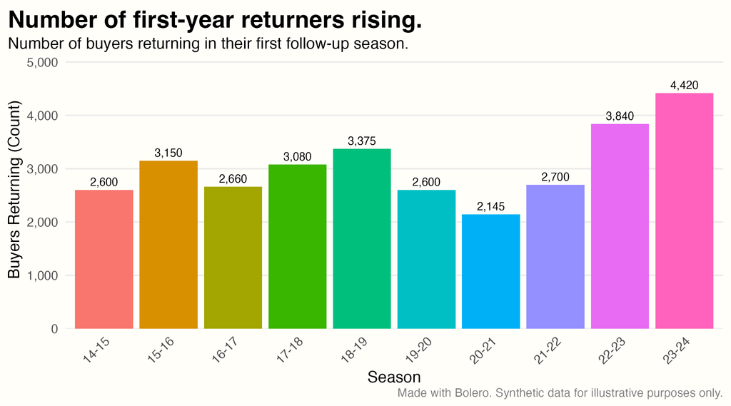
Separating the two types of individuals based on their behavior allows us to then look at our first-year retention rate over time. So, for example, you might make a chart like the one below and see that for the past ten years, this organization has had a pretty steady first-year retention count, then a recent uptick in the total number of first-year buyers that have returned.
From counts to rates: Calculating your first-year patron retention rate
How to read a first-year retention rate for your performing arts organization
If we divide this number by the total number of new people who could have come back, this comes out to about 15%. This means that somewhere between 13% and 17% of individuals who were new for the very first time came back again the next season. We mark the first-year retention rate using a little star. Note that the numbers shown below are the exact same as above. We’ve just swapped over from using a whole bar and now have a single point (you’ll see why in a moment).
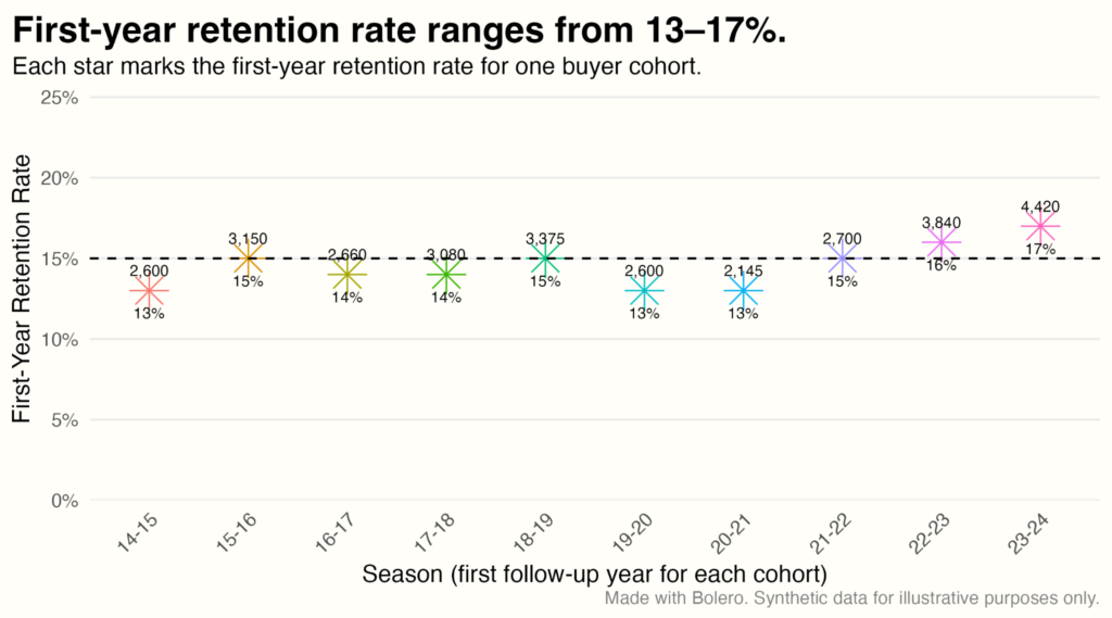
Separating the two types of individuals based on their behavior allows us to then look at our first-year retention rate over time. So, for example, you might make a chart like the one below and see that for the past ten years, this organization has had a pretty steady first-year retention count, then a recent uptick in the total number of first-year buyers that have returned.
You might now be asking yourself: Is 13–17% good? Bad? To our knowledge, there’s no clear industry benchmark that annually separates out these numbers for organizations of different sizes and locations. But even if we had a rule of thumb of what is good or bad, we need to stop and ask whether a chart like this really shows if we are getting better at retaining individuals over time.
First-year retention is not exactly what we mean when we talk about long-term retention. Charts like those above don’t exactly tell us what happens to these individuals over time.
If we were to stop here, we might as well just jump back on the Sisyphean treadmill and cross our fingers that next year’s numbers will be higher than this year’s numbers. So let’s not stop! What we see in the above chart is only the start of a retention analysis.
Simply measuring first-year retention is not enough. If we want to truly understand whether our retention strategy is working, we need to track each and every group of people over time. What we really want to know is what percent of each cohort sticks around as the years go by.
Cohort analysis: The tool that unlocks long-term audience loyalty data
Tracking every group of new ticket buyers season by season
All we have to do to figure out if we are getting better at retention over time is run the data to check whether each individual showed up in seasons after the one in which they were first considered new.
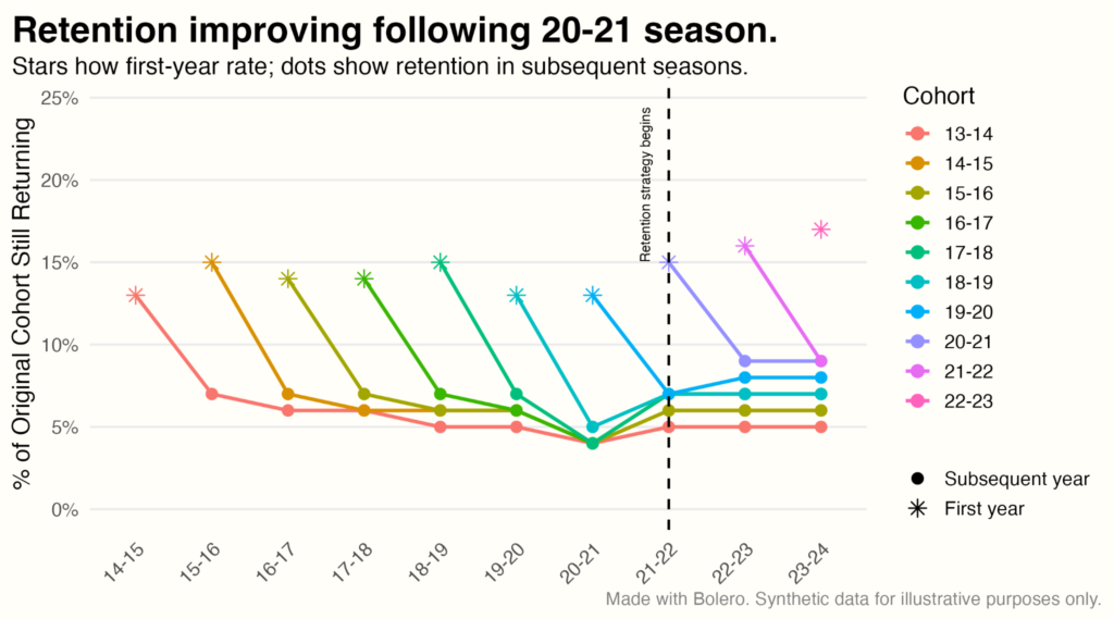
Instead of having stars for only our first year, we can calculate this for each and every year for each and every group. We see this in the chart below and add each subsequent year as a dot so we can easily distinguish between that group’s first-year measures and every later one.
Reading the cohort chart: What each line tells you about your audience
Following one cohort through time to understand patron loyalty
Now we’re cooking with gas. We interpret this chart by following one line over time. Let’s follow the red line together to get a better idea of what’s going on. The red line starts where it did in our previous chart. It shows that 13% of the individuals who were new in the 2013–14 season showed up again in the 2014–15 season.
From that same cohort of individuals who were new in 2013–14, only 7% showed up again the year later. This line then flattens, meaning that year on year, we can regularly expect 5–6% of buyers who originally were new in the 2013–14 season to come back. Seeing this flat line is exactly what we want to see because this means there is a small group of people with whom we have built and evidenced a long-term relationship.
We can then trace each and every other cohort over time. And most importantly, we can ask whether or not our organization is getting better at retention over time.
Is your organization getting better at ticket buyer retention over time?
Using cohort data to drive arts marketing and campaign decisions
The answer to this question for this organization’s data is “yes.” Each new line starts and stays just above the one from before it starting around 2020. Seeing a line start above the one before it means we’re starting a new cohort with a higher percentage of individuals that we retained. Seeing the newer line stay above the previous cohort means that we are retaining more individuals over time.
Now there are a dozen different directions and stories you can take from this type of analysis. You can start to drill down to see what was happening at different points in your theater that led to increases or decreases in retention rates. You can use the cohort data and join it up with your ticket revenue to see how much revenue you can expect these return buyers to bring in. You can roll up your sleeves and use this data to retention strategy and start targeted marketing campaigns.
But most importantly, data that goes beyond simply measuring first-year retention is where all long-term retention strategies begin. While there is nothing wrong with only looking at first-year retention, we see this as akin to trying to look at something like a beautiful sunset or a sprawling canyon with goggles that only have a tiny slit in them.
Where to take your retention strategy next?
If you are a Spektrix user, the good news is that the data you need to run this exact analysis already lives in your system. Your historical ticket exports contain everything required to build a cohort table: A buyer ID, a transaction date, and a season label. The first concrete step is to pull a multi-season transaction export and identify, for each account, the season they first appeared.
At Bolero, we find that Spektrix systems make pulling the historical reports needed for this type of analysis very straightforward. The analysis itself, however, demands working with a large volume of ticket data at once, and modern data science tools are what make it manageable at scale. If you want to explore what your own cohort retention picture looks like, we’re happy to run this for you (and many other analyses you can do with your Spektrix data).